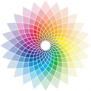
 At Kingdomedia we understand that colour theory strengthens your brand and is a powerful tool when developing a corporate identity. It’s one of the key nuts and bolts of creating a certain ‘look’ that markets a business or charity. We have gained a reputation for producing vibrant, eye catching designs, so we thought we would elaborate on why we have chosen certain colours in our work.
![]() For CJ’s Holidays Homes we wanted to communicate something of the quality and luxury of the caravans and lodges on offer and also the friendliness of this service. So we focused our design around the colour purple. Purple insinuates a product or service is high-end with the best on offer.
For CJ’s Holidays Homes we wanted to communicate something of the quality and luxury of the caravans and lodges on offer and also the friendliness of this service. So we focused our design around the colour purple. Purple insinuates a product or service is high-end with the best on offer.
 When you leave your important parcels with International Freight Solutions Ltd you want to know they are going to be safe and secure. We chose blue as the main colour for this site as it communicates trust. A darker blue also helps to demonstrate the strength and confidence of the business.
 We picked a lighter blue for Liberty Church as we wanted to communicate all of the above alongside a sense of freedom and calm. This relaxing friendliness translates into trust and hence it is often used by banks, The Co-operative Bank for example.
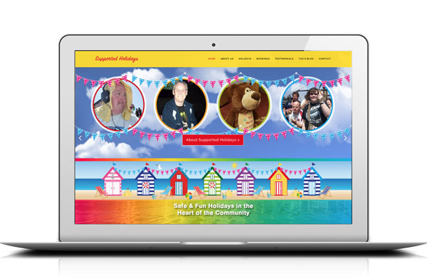
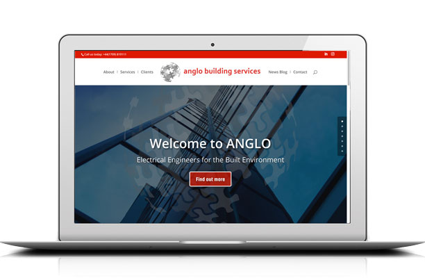
A sunny yellow was used for the Supported Holidays by Morley Care website to advertise what will hopefully be the fun, sunny and happy holidays that these are. A strong red was used for Anglo Building Services in sophisticated touches to demonstrate a sense of importance, strength and solidity that in turn communicates reliability.
